D&E Recovered research
Pinterest:
https://www.pinterest.nz/yihang1725/recovered-bm-kris-wu/
Main pictures (Media) refer:


Brain storm ideas come from:
https://www.billboard.com/articles/columns/hip-hop/8061772/kris-wu-bm-video-fashion-burberry-made
Deep understanding:
https://twitter.com/Burberry?ref_src=twsrc%5Egoogle%7Ctwcamp%5Eserp%7Ctwgr%5Eauthor
http://pearlmodern.blogspot.co.nz/2011/05/in-rotation-freddie-hubbard.html
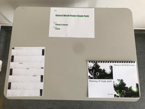
Studio wall:
First week Final week


Initial works:
Research diary:
Final works:


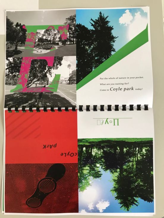
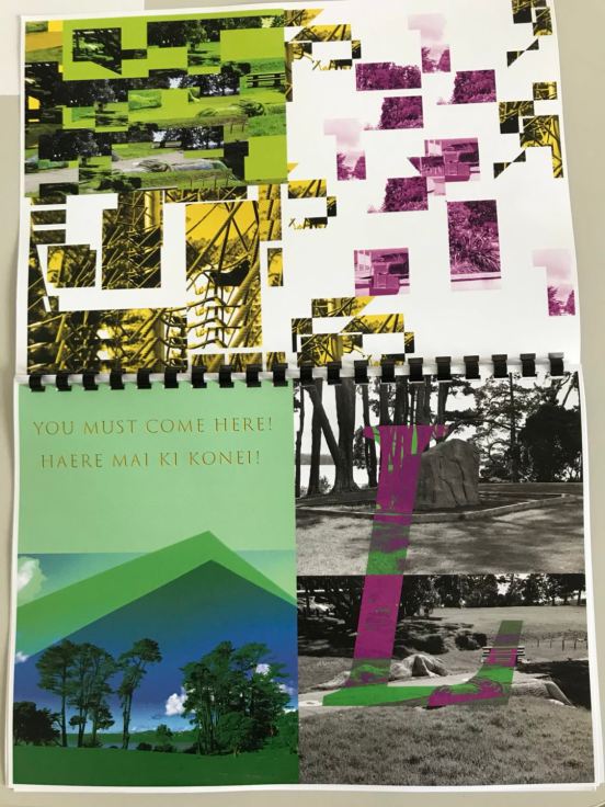
SW ? Scape Catalogue (Booklet)
BOOKLET PDF
This project, I extracted elements from Creative and design (? Scale project). I made posters there, and now, I create more works, sort them and edit them together. This is why I chose to do the booklet and I hope that will be appreciated by more people and more than 1 or 5 piece of work. Get more , more contrast, more kinds of posters elements and I will create the order to make them, make them more vivid.
Research:

")


I found a lot of useful, various booklet or brochures. I like them and the fresh feeling is very suitable for the poster make I want to pursue. Nature is green, but I will not set the theme color to green, because my booklet theme is about “mood”,”inner” and “memory”. I will edit the different colors of posters together, in terms of typography, as a poster booklet, I didn’t have much content and I searched some of font styles, and I found that it was difficult. It depends on my poster, so the font is different, each one gave me a different feeling and memory and I chose different fonts.
Color system:


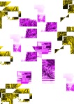
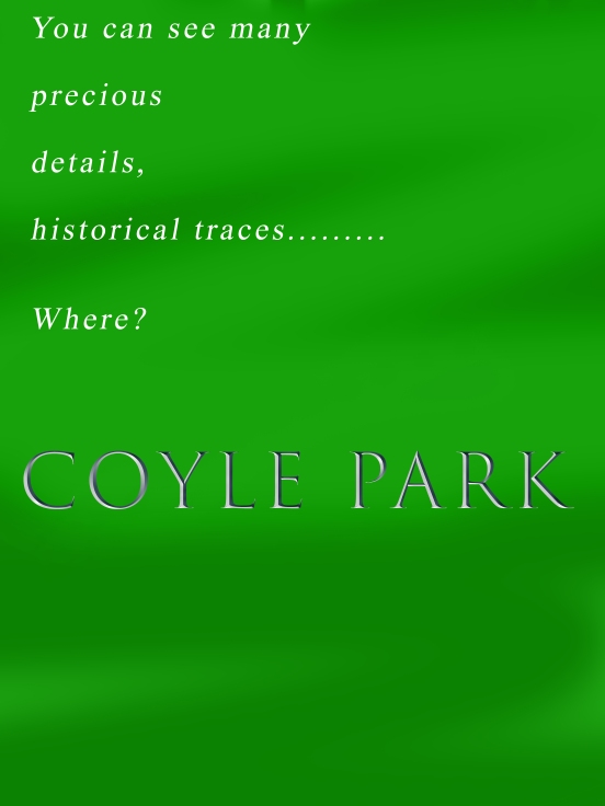
A very important part of my whole project research, color system. The color of each image is different, whether it is the combination of the font and the background or the color from my recollection, warm or cold, passion or calm……..These are the results of my explorations of contemporary color systems. Each colors collocation makes the content of each image expression is different and also injected my “emotion”, after the color gradient, change is more extreme and research variety of colors, which also help I was able to successfully complete each work design.
Outcome:
A4 size
Horizontal layout
References:
https://www.pinterest.nz/yihang1725/framing-the-scape/
http://allah-las.com/post/89062830327
http://www.ufunk.net/design/philosophical-concepts/
http://theartsyfartsyartroom.blogspot.co.nz/2013/11/3rd-grade-complimenting-complementary.html
https://graphicriver.net/item/grunge-tree-silhouettes/4598989
https://graphicriver.net/item/vintage-winter-holiday-backgrounds/6330719
C&D Artist Research
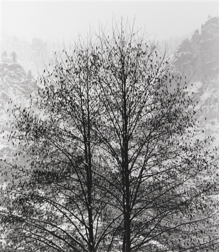
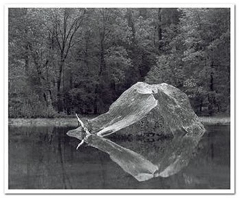
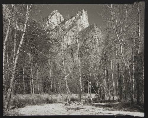
Research of photography:
My research direction was in nature poster and scenery photography, many natural work make me impressed, some of the special black and white photographs, and it is the way I need to deep research and explore, because I need to edit my photos upload to Photoshop, it is a process of making posters are particularly important, so I need to draw lessons from the ideas of many photographers, to observe how they shot in black and white photos and combining with the my idea to make a series of work.
In addition, the poster with the color contrast, background picture of grey. Photo not only need to be photographed but also need to be processes using software.
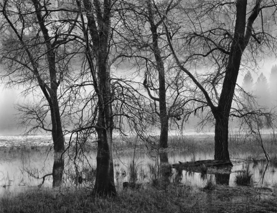
Controlled Burn and Dodge #1 – Special Edition Photograph
Bob Kolbrener

Vaughn Hutchins
TREES, VALLEY FOG, DUSK, YOSEMITE VALLEY, CA
John Sexton.
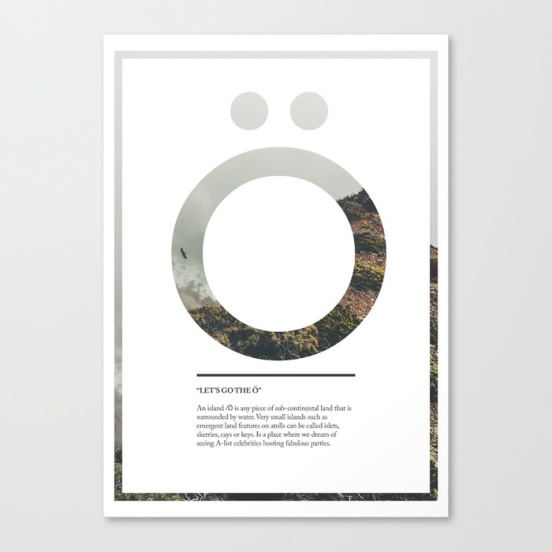
Research of natural poster:
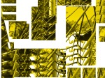
This is a process I took away from the camera, using digital art (Photoshop). My first series was focus on detail layout, cutting, reassembling, font recognition, color screening, etc. When I got some feedback after I felt that too complex, and then I search on Pinterest, I found a lot of designers for natural poster idea is advanced. Simple, this is how I feel after seeing their work. It doesn’t mean simple to make or less elemental………they are made in ways that are more interesting and easier to understand. Then I painted many fonts on the paper and combined with simple landscape as a background, I think big fonts more lofty and can give people fresh and long-standing feel, with a bit of blur color contrast, makes the gray background with simple and dreamy feeling.

Simon Granath


Brin Farley


John W. Hanawalt

Art by ASolo
Images and pinterest references:
https://society6.com/product/big-letter-watercolor-letter_notebook?sku=s6-7090856p59a202v706
https://www.pinterest.nz/yihang1725/framing-the-scape/
http://shop.anseladams.com/category_s/60.htm
http://shop.anseladams.com/category_s/113.htm
http://shop.anseladams.com/Trees_Valley_Fog_Dusk_Yosemite_Valley_p/17150482.htm
https://society6.com/product/ampersand-ctd_print
EP Business Rationale
Yihang-Integrated-5402
Project brief:
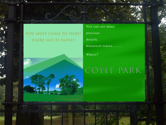
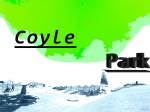
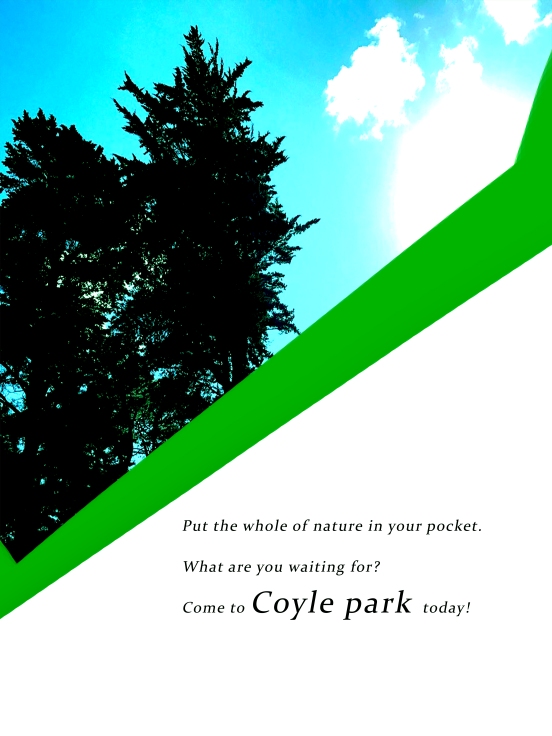
I’ve always had a very fresh feeling for Coyle park, and this project has finally enabled me to complete my emotional expression of it. I am devoted to making natural posters and combining them with the scenery and using digital art software to create them. At the same time, I consider the New Zealand tradition of ancient poster making style, bringing these elements together and creating value …
Client:
Numerous research has shown that, until now, New Zealand’s vintage poster art was astonishing. I also follow this artistic element and add my feelings about it to my creation. This is to attract those who live in Coyle park. Nearby people come to this park and enjoy weekend or holiday time with family. During my visit and the photos I took, I noticed that there were not many people going to the park, so I decided to show my feelings about the park and the natural scenery, to attract people living around park, to enjoy the scenery there.
Materials:
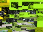
As a digital art, Photoshop is my primary software. In order to achieve the visual effect, and let people think Coyle park is interesting, I tried a lot of creative production methods. First of all, the original photo is no problem. The 5DS camera’s ability to work makes me satisfied.


After I edited the image to Photoshop, I tried cutting and resizing the image with a lot of blurring effects (dealing with the background saturation and brightness), and the effect of each layer was different. Green and gray lines are my main hues. And I think the most important step is output. Print quality and picture quality will affect the final product. I chose 220gsm paper, A2 size.


Costs:
Cost considerations in this regard: Working hours, output (printing) costs and official software purchases are the main considerations …
Each poster is made in about 30 to 45 minutes.
Print cost of 5.00 NZD per each poster (printing more gets a discount to 4.50 each)+ 1.00 NZD (on-road fee), print paper quality: 220 gsm, fee: 4.00 NZD.
The total output of the number of pictures is expected to be around 70 to 110.
Working time price setting: Every 30 minutes work, 8.00 NZD. (At least 20 minutes, 20 to 29 minutes, charged 7.00 each)
Total: 18,99, each poster * (First 10 posters, give a discount, 11.99 each)
Coyle park poster board (Display) costs: 23 NZD per day
Pos: Point Chevalier community library sale: 25 to 35 NZD(Contains: 5NZD for librarian promotion if sold)
- Continuing with the librarian to discuss the possibility of reducing display costs.
Outcome:

A2 size
Risk:
Whether it can be sold (price, quality, extent of collaboration between library manager and Coyle Park)
Goal:
Focusing on getting people to understand that nature can be appreciated from different perspectives, gradation and visual effects. Let people feel more about art and nature. Different posters and the style of expression may also bring back some memories, happy or sad…
In addition, more vintage posters give me a lot of ideas, creativity and motivation. I will do more in-depth analysis of how this kind of poster will keep the market competitive and be able to sell at a good price.
Research:
Vintage posters are very popular now in New Zealand. Locals love them, because they are nostalgic and memorable. Design elements from different countries have been pieced together, and the design elements of the 18th and 19th centuries have been imitated today. I found a lot of vintage posters on Pinterest, Auckland museum, online souvenir shops and gift shops. Most tourist souvenir shops have vintage posters.
The background colour of the poster is mainly gray and some interest words are added to the foil image. The design concept of each area is roughly the same, but when looking at the detail, besides the colour being similar, reflects the traditional and the old feeling, and in addition, there are many patterns of embellishment. This makes the poster more vivid.
Marketing analyze PDF
Research Reference:
Lake Tekapo Art Print by Ross Murray
https://www.huffingtonpost.com/2013/07/18/vintage-travel-posters_n_3612272.html
ST Reflection
Variety skills and practices are what I lack in studying design. There are not be major mainstream professional presentations, but practicality is high, and you will be pleasantly surprised when you learn and make what you want, because different materials will give you different visual effects, with clay, wires and Wood and more. I learned different artistic and design ideas to use in different tools or equipment, it is interesting and attractive, allowing me to have more fun with a variety of skill training. Of course, I learned a lot of material usage, even many things I did not touch and let me learn different areas of knowledge. These are different from the graphic design, photography and space design and so on … should be more real training, how to weld each wire, let them be more sturdier in series. How much moisture is suitable for fixing the clay or how exactly and exactly cut the wood to meet your desired standards. These need to use both mind and hand at the same time, which further enhanced my practical ability. As I learned different practical skills, I started making some gadgets myself and I was proud because I had more personal pieces that I could stock them up, take pictures of them or hang in my own room, which is benign cycle. I love to do them after I will delve into them. I’ve done some welding work and I think I developed a new skill because it is easy to understand and accepted by me and I really enjoy the whole production process whether I’m doing homework or doing extracurricular self practice. I will extend it, I will study it deeply. Actually, my parents’ work is related to welding and wires. Although it works more on architectural design and engineering, this is not a problem because I already know some basic knowledge and I will have many opportunities to study in depth.
As each course progresses, I find that I can bring them together. Digital and tactile Ideation is where I use the most welding, and I got EBB this verb it is difficult, in the initial research and exploration, I can not be satisfied with any 3D materials it can be associated …. But when I learn After welding, I got a lot of ideas, I made some wavy frames, watery embellishment. After that I found that I was very satisfied with it, because my proficiency in welding is what I did not think of. I also have a great interest in wood making. I can do small boxes or small bookshelves to increase their availability, but they are not as strong as I expected. It’s a risk that I do not fix them well, which affects whether it’s used by an individual or mass-produced by them, and selling them …. Also, in my first week’s work, we were asked to do some paperwork Models, rectangles, squares, cones and more. I think they are very suitable for re-made on the wood, cutting each piece and then stick them together or use nails to fix them, the effect is surprising. Visually, let me have a more intuitive perception of different shapes, and even I can apply them to my other comprehensive projects.
In the process of learning these practical skills, I also encountered obstacles, nothing is perfect, is easy. Therefore, during this period, I feel tired, working in a dusty workshop, I hate it. Even afraid to try new tools (because of some tools, equipment is dangerous), instead of graphic design or painting. But when I actually tried them and asked the teacher many times, how to use some tools, how to get the work done quickly and so on, I was even more confident and successfully completing different projects. And I slowly understand how important the artistic environment is, and the dust and sawdust are full of art. Like you think this pattern, photo or some works of art you do not like, hate them, but this can not judge the right and wrong, you do not like does not mean that others do not like. This is the art of the wonderful place, which I learned in these five weeks.
Very grateful to the teachers in the workshop that gave us those knowledge, those truth, happy, sad, sweat, smile. Bit by bit,still come to my eyes, in the future of learning life I will try different tools, equipment and fight with different challenges. Practice more, exercise myself and get more skills.
C&D Installation&Process
Making posters (graphic design) is one of the most successful programs I have learned during this semester. I quite like the use of digital art to create works that I have a personal significance, and I got advice from classmates and teachers, which give me more confident, creation and makes me deeply in love with it.
“Got a lot of confidence so that I can be patient”
Try to express each piece of work, natural scenery and add the most fonts elements, making the overall look more attractive to the audience.
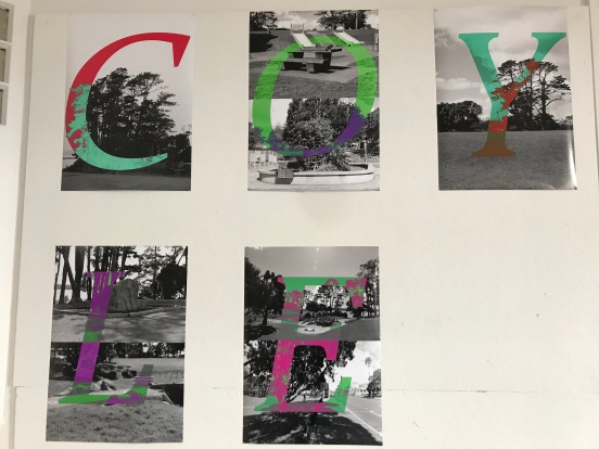
I have recorded everything about my understanding of Coyle park and I want to record my love or sadness there by way of posters. In any case, the permanent memories that I bring there are absolutely unforgettable! Each photo, bit by bit …. They are still in front of me. This project let me fulfill my wish, I can save the real memory…
Here are my works hang on the studio wall and the slides of all my works …

Sw Timeline
Timeline. Architecture. Pacific art. Social media


(c) Copyright 2017 Yihang Li. All rights reserved.
EP Creative Projects (Poster)
Products (poster)
I committed to creating natural poster (Coyle park poster) products sales, in the beginning, I designed some bold, futuristic poster, cutting pictures, random layout, background blur processed and bold used color,etc… When I finished, I shared my work with Cris and classmates, but when they gave me feedback, I realized that it wasn’t fashionable and attractive in the present….

Then I did the market analysis and research. Rural, vintage travel poster are loved by New Zealanders, even if it’s “out of date”. Then I had to change my mind, because I have to sell it…. I created some posters which I think are the most appropriate examples and when I research a lot of poster designs, almost every New Zealand gift shop would have vintage posters. I think it’s a poster of New Zealand style and the gray color poster draw my attention. Later, without changing the picture form and use the same tools for design in Photoshop, the color is I change most, for instance, some New Zealand local network art shop and souvenir shops, but, when I looked the endemic world store, I was suddenly inspired by the vintage poster design that I liked.
Google / endemic world research:


Each work I define the standard, that is a new era of vintage posters, people can still see their familiar vintage posters at the same time, also can see fresh elements, interesting subjects, the diversity of language, color considerations and “question”. Why not? Draw them to the park and write surprising words on the poster. These are the things I want to say and the intention. Advance guard does not lose witty, lively do not lose the tradition.
My works:


Keep going:
Now, I’m going to continue my work with more emphasis on font and color processing, effect rendering, etc. Finally, I will edit them together and selling
Coyle park boards show: